


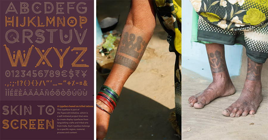
What could an Adivasi tattoo or a Kolam design possibly have to do with typography? Look no further than The Typecraft Initiative that re-presents indigenous South Asian crafts through novel typefaces. The project’s founder, Ishan Khosla, is a visual artist, designer, researcher, and an educator, and his partner-in-design, Andreu Balius, creates typefaces for a living and is also an educator. The duo has worked on several projects with craftspersons in India, since 2011.
Whether it is Godna Adivasi tattoos of Chattisgarh, Rabari pastoral nomadic embroidery from Gujarat, or Karnataka’s Chittara floor art, the duo always begin by deeply immersing themselves in the craft techniques, traditional design approaches, and the community itself.
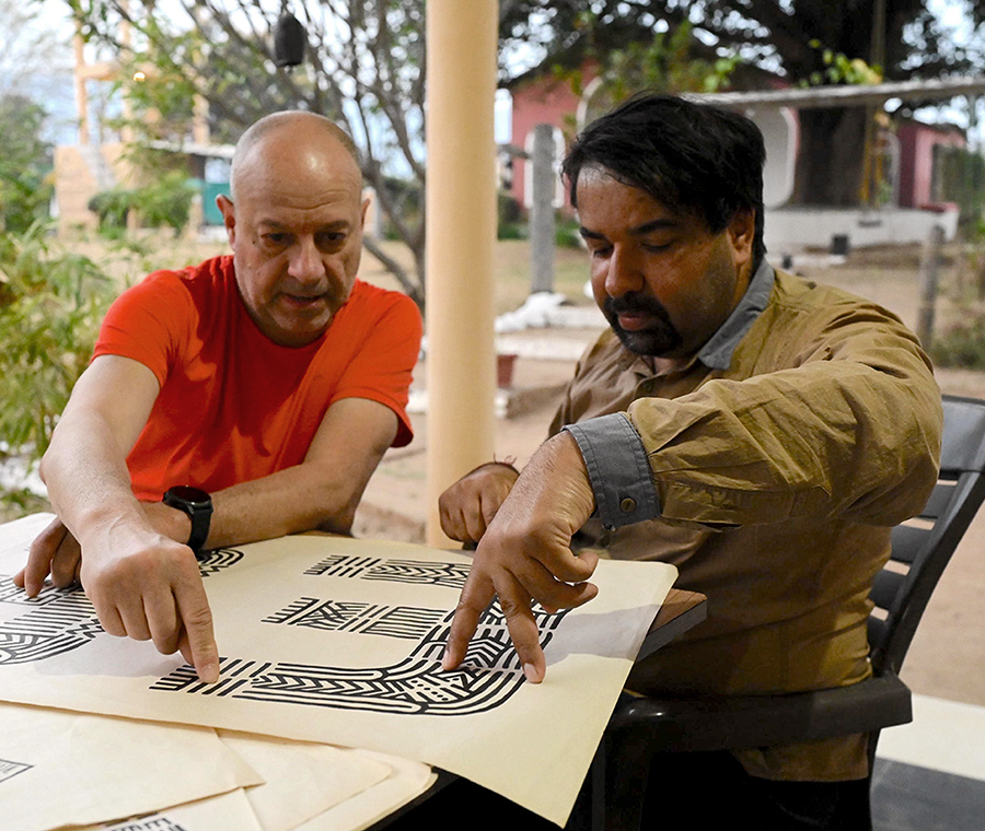
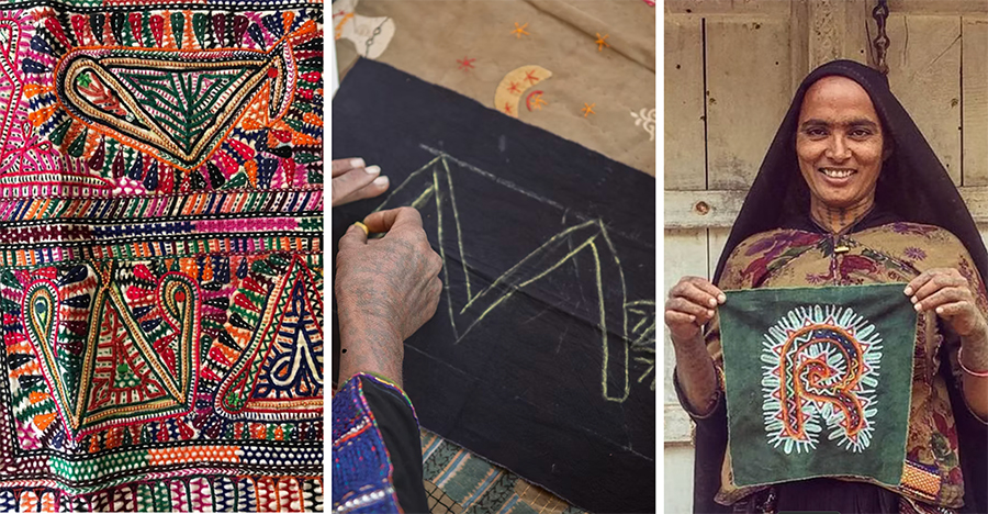
The process to create a typeface is time consuming, taking up to a year, and it all starts with hosting an initial, on-site “Design Methodology” workshop with the craft community. Each workshop yields unique designs and motifs that are then scanned for type vectorisation. Khosla and Balius emphasise that their projects are mutual journeys of knowledge sharing, where they end up learning a great deal about design from their collaborators even as they share with them new ways to think about their craft.
Priyanka Sacheti: Could you begin with what sparked off the creation of Typecraft?
Ishan Khosla: While working on my final year MFA thesis at New York’s School of Visual Arts in 2004-5, I got thinking about how Indian design education platforms were still heavily influenced by external Modernist concepts and not really looking at the Indian context as much. In the case of my field — graphic design — there was a disconnect between design education, practice and our indigenous crafts. For my thesis, introspecting about what Indian culture represents, I worked on a brand logo among other things. It was an intersection between Indian culture, food, clothing, and typography. This assignment germinated the seed of an idea that eventually became Typecraft.
Andreu Balius: I became interested in how typefaces can go beyond type design itself, exploring typography’s political and social implications. During my travels to the Himalayas, I encountered Ishan’s work and liked how he was integrating craft and local culture into his designs. We started talking about typography and, in 2015, we decided we would collaborate on Typecraft.

Sacheti: Can you elaborate on how Typecraft implements the “Theory of Change”?
Khosla: Take Gond art, which is sacred and important to the community. When you use it to create a fridge magnet or a cushion cover, it becomes a mere decorative style to be looked at and forgotten. The typeface, however, is not an end; it is a starting point for more creativity, innovation and action. It’s a tool offering multiple communication possibilities and ways to engage with it.
This is one way in which we implement the “Theory of Change” within the communities we work with, from Adivasi artists to people from marginalised communities, and refugees. We obviously cannot completely transform a community just by working with them for a few weeks. However, it can become a starting point for them to think about their own products and the possibilities beyond what they are already creating. We are not replacing or getting rid of the craft. Instead, we are exploring an alternative form of the craft, which leads to more possibilities of change for them.
The idea of Typecraft, at least initially, was to bring Indian culture into graphic design and also significantly re-frame the dialogue between urban and rural residents. Given the largely urban-centric engagement in graphic design, it was a way to engage with the communities of rural areas, respecting and understanding them and their work.
Sacheti: Could we touch upon your insistence on working with craftswomen?
Khosla: While working with NGOs, I used to design annual reports and inferred that in rural areas, women are the ones who ensure the money doesn’t get wasted.
Typecraft also became more political over time as we noticed deeply engrained patriarchal structures in places like Barmer, Rajasthan, where girls were not attending school, for example. We observed that for the women involved in these projects, earning money and encountering literacy in the form of letters was empowering. So then, working with craftswomen became important for us over time.
Sacheti: Can you talk about the design methodology workshops Typecraft holds?
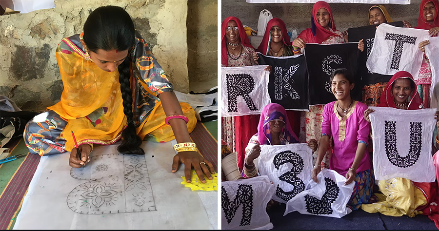
Balius: These workshops are a way to engage the craftswomen in the design process. When we (first) propose the idea of them sketching their own designs, they are unsure as they largely draw on ancestral patterns or family legacies of design. One of Typecraft’s main goals is to provide this freedom, creativity, space, and intimate atmosphere, where they can see and realise their own ideas for the first time.
Khosla: Before embarking on any Typecraft project, we have to deconstruct the craft and figure out if we can mimic that craft in an inexpensive and quick medium. Some crafts like Godna tattoos are painted, so that’s easier. But others, like Katab patchwork, involve folding and cutting the cloth. So there, we used paper as a quick, cheap tool, which also allows you to make mistakes. The feedback we got from the women was that they had previously never gotten that opportunity to experiment or play around or have authorship over designs; previously, they were simply given designs to stitch.
Sacheti: Could you describe how a Typecraft workshop plays out?
Khosla: We don’t just immediately start off with making letters as every group has varying exposure to creating designs. For the Katab patchwork project in Barmer, we began by saying — have fun and make designs by cutting up newspaper — it’s like a warm up exercise. Once they started to get used to scissors and paper, we started with the building blocks of letters, as one does in design college. It was only after five or six days we got into making the foundation of the letters.
Balius: It was a very long workshop — working eight hours for ten days. We had to learn about the stitching techniques and think about transferring it into letter shapes along with initiating women into the sketching process. But we were not directing what they were doing; we were facilitators. Only when the women started to enjoy the process, we explained Typecraft’s purpose and shared examples of other workshops and typefaces, and then they began to understand the larger goals underlying their sketching process. It was only after the fourth or fifth day that we started to get sketches which could be used to create the shapes of letters.
Sacheti: How did the women respond to seeing the results?
Khosla: I recall that one or two women started to recognise the letters or they wanted to make a letter that was a part of their initials. By the end, some of them even learned how to write their name and wanted to learn English.
Balius: For us, it was very important that these letters emerged as the byproducts of a design process that they were deeply involved in, and so, the results were exciting for them.
Sacheti: Do certain crafts present challenges when it comes to creating typefaces?
Khosla: I will focus on Rabari embroidery from Kutch. In any project, we seek to learn about the community before starting a workshop. In the case of Rabari, we were told that the women could also draw — this was also our first time experimenting with embroidery. However, we eventually realised that none of them could draw. They could only embroider and that too from memory. It was very challenging for them to embroider entirely new designs like letters.
We had to innovate. The NGO we were working with had a huge archive of old Rabari embroideries. We showed them to the craftswomen and how they could incorporate those embroidery motifs into parts of the letters. We also thought about what would make it feel specifically Rabari to them? We then incorporated a Rabari detailing relating to daanth (teeth). So the Rabari typeface has spiky teeth and loops, for instance. We have to understand the lexicon of each craft. Each one is unique. An approach that worked for one craft will not do for another.
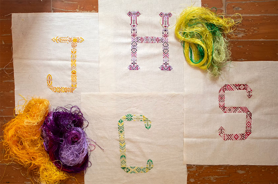
Balius: Each project and workshop has its different challenges; one of the biggest ones is how to translate the crafts’ patterns and the associated symbolism in the motifs into letter shapes. Sometimes, it’s just about reproducing specific patterns into the shapes of letters, so you combine and adapt. But other times, we have to deeply consider the concepts and techniques underlying the craft and visualise the letters in a consistent way. Craft is a cultural language, an expression of an identity for the community. However, type design is also a language in itself as we convey meanings through the shapes of letters. So we are dealing with a meta language.
Sacheti: How do you share designs once you create a type? How and where is it used?
Khosla: We share it via our website and on social media. We use it internally to create posters and graphics. Meanwhile, people also use it in various other contexts. For instance, the Godna typeface was used in the signage for Gwalior airport. An American museum, Goldstein Museum, is using it for an exhibition related to Indian textiles. Most recently, the San Francisco Museum of Modern Art (SFMOMA) has acquired the Baiga tattoo typeface as part of their permanent collection. We don’t always see how people are using the fonts as not everyone always shares how they use them.
Balius: The use of these typefaces is limited in a way as they are not intended to be used for long or reading texts. They have a very strong personality; they have to fit very well to a specific usage.
Priyanka Sacheti is a writer and poet based in Bangalore, India. Raised in Oman, she was educated at Universities of Warwick and Oxford, UK. Her essays, with a special focus on art, gender, diaspora, and identity, have appeared in various publications, such as The Guardian, STIRworld, Hyperallergic, and Jaggery Lit.
