


“There is no word for ‘design’ in our Indian languages,” says design historian Suchitra Balasubramanyan. The discourse, she points out, has been built almost entirely in English, shaped by upper-caste, upper-class practitioners and Western standards. For approximately five centuries, design in the subcontinent has served colonial, and continues to serve post-colonial, capitalist systems. In the process, design has played a role in erasing, distorting, or disrupting earlier forms of indigenous visual language and culture. So, when India’s readers look at what lines their bookshelves, whose visual language does it represent? No design is ever neutral and the covers of Indian books in English are no exception.
A Culture of Borrowed Templates
In a podcast on decolonising design, Dr Dori Tunstall reflects: “We often define [design] as something that happened in Europe in the 1800s.” This hierarchy is entrenched. European traditions are treated as the measure against which all else is compared, while everything outside that frame is folded into the category of “craft.”
This hierarchy is also visible when it comes to Indian bookshelves. In Japan or the Nordic countries, book covers reflect aesthetic styles that connect to local geographies and culture. But Indian covers often lean towards global templates.
Designer Amit Malhotra says this is because India’s design language is “unresolved but distinctive.” It is shaped by a cacophony of regional scripts, cultures, politics, aesthetics, and visual influences — too many to evolve just one dominating, representative style that serves the mass market in India, and so, the default is often derivative of “standard” Western design templates. “In the West, book covers can be mapped to distinct design languages because they hold the monopoly on what is considered design. Their design templates are highly recognisable the world over. But we [in India] don’t have those sorts of recognisable templates,” he says. Designers here also have varying levels of familiarity with Western design language that shapes their work, Malhotra adds.
A cover serves many purposes. It must speak to the story inside, appeal to the intended audience, and stand out when displayed among books in its genre. So what drives strategies in India — cultural cues, marketing logic, or design trends? And how do these covers shape our expectations before we even open a book?
Between Covers
Every year, since 2015, Oxford Bookstore, the book retail chain store run by the Apeejay Surrendra Group, awards the Oxford Bookstore Book Cover Prize, recognising the “best” examples of cover art and design from India. “The Prize highlights the crucial balance between illustration and narrative, underscoring the power of visual storytelling in shaping a book’s identity and success,” states the Oxford Bookstore website about its 11th edition in 2025. In 2024, it was Bhavi Mehta who won the award for designing Pradeep Sebastian’s The Book Beautiful (2023).

Mehta says that for an artist to become a book cover designer, it all starts with knowing the text. If the artwork is placed before the book, the design will “not work.” Covers are rarely the work of one mind alone.
“Cover design involves the editorial, design, and marketing teams working closely to balance the author’s vision with commercial needs,” says Pallavi Narayan, General Manager of Corporate Communications at Penguin Random House India, explaining the organisational level perspective of Indian publishing houses. However, too much flexibility, she adds, can lead to endless iterations. Amit Malhotra agrees, calling the process “collaborative” — fonts may come from one source, images from another, and illustrations are often commissioned. The best covers emerge from this shared effort, striking a balance between personal vision and market demands.
Maximalism, Minimalism, and the Indian Eye
“I believe that good cover design widens your perception of the visual world,” says Aakriti Khurana, Design Manager at Penguin Random House India. She talks about the challenge of arranging titles, subtitles, blurbs, and endorsements “in ways that hold attention in an attention-deficit age.”
For Khurana, India’s visual sensibility is not absent; it is plural. “Maximalism from Indian arts and handicrafts, information overload from different media — we’re generally more comfortable with chaos. But this flows alongside influences of Western schools of thought: brutalism, gestalt compositions, minimalism.”
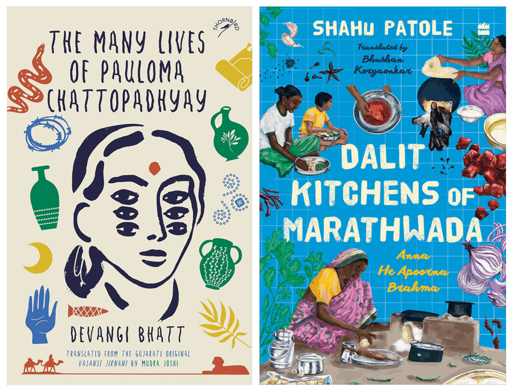
Malhotra’s cover for The Many Lives of Pauloma Chattopadhyay (2024) marries inspiration from folk art with hand-drawn typography, balancing India’s comfort with visual abundance against a clean, contained composition. It resists polished minimalism in favour of a “handmade,” organic aesthetic, embodying a culturally-rooted design language but with a nod to Western minimalism.
The cover of Dalit Kitchens of Marathwada (2024) takes a different, but equally revealing, approach. It places the women, tools, and ingredients of the kitchen in full view, resisting symbolic shorthand in favour of lived reality. Its vivid palette and hand-rendered typography embraces cultural specificity, balancing abundant detail with compositional structure.
Designer and activist Céline Semaan of Slow Factory notes that “minimalistic design trends draw from colonial aesthetics that erased cultural specificity, texture, and tradition in favour of uniformity and control.”
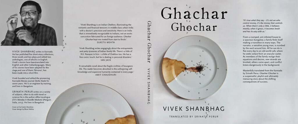
But minimalism can also create unease rather than erasure. Bhavi Mehta’s cover for Ghachar Ghochar (2015) is a study in this tension: an immaculate white background, a perfectly centred plate, and crisp typography — into which creeps a coffee stain pooling like a bruise, a scatter of ants breaking the sterile surface. It is minimalism made unsettling, an echo of the novel’s quiet domestic claustrophobia. It uses Western design language to illustrate the core idea of a very Indian tale. Similarly, the cover of The Good Muslim (2011) uses a burnt red book as its central image, its charred edges exposing layers of text. Paired with restrained typography, it speaks through absence, turning the damaged object into a witness. The design carries political weight without ornamentation, making it both stark and memorable.
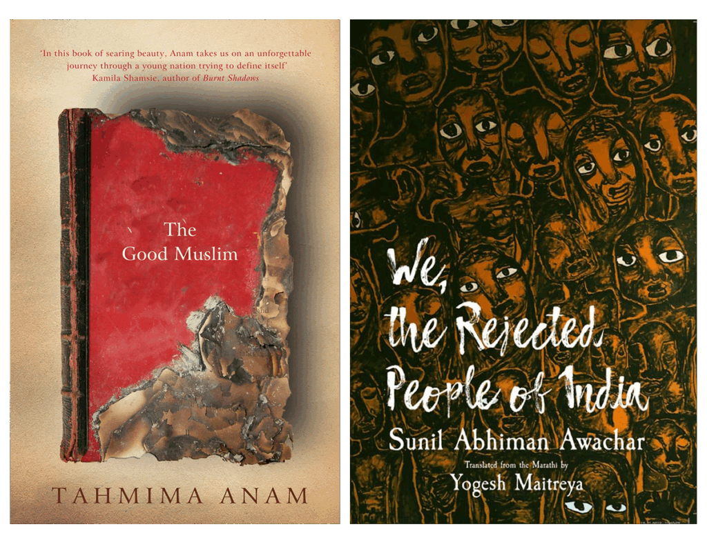
In We, the Rejected People of India (2019), Dr Sunil Abhiman Awachar — an Ambedkarite poet, painter, and activist — fills the frame with a press of faces. They are watchful and unblinking, their features marked by thick, hurried lines. The earthy ochre of the cover is an exception in his practice; much of his work is in stark black-and-white, relying on dense, textural linework to create immediacy and resistance. The repetition of faces becomes a visual chorus: a crowd that refuses to disappear into the background. Awachar says he wanted to draw their presence in a way that holds both exclusion and dignity — a people sidelined but not erased.
A comparison shows that while Mehta wholeheartedly embraces some hallmarks of Western minimalism, Dr Awachar does not, demonstrating how cover designs by Indian designers often depends on what influences they draw on.
The Politics of Recognition
Today, mainstream discourse on book design continues to exist almost entirely in English, both in India and in “mature markets” like the US and the UK. The question of who defines design — and whose traditions are recognised as the “standard” — is deeply political. In practice, conversations about decolonial design are often led by those from upper-caste, upperclass backgrounds in India, reflecting the limited access to design education and professional spaces.
Balasubramanyan argues that the Eurocentric story we have told of design must be dismantled to create space for indigenous ways of knowing and being. The woven book cloths and illustrated manuscripts of Assam, the hand-painted scrolls of Bengal, the block-printed fabric covers once used in Gujarat — these are not “craft” objects waiting for an upgrade. They are designs born of lineages that predate much of what the West calls “modernist design.”
The journey from “craft” to “design” should not be thought of as climbing up the ladder of refinement, as imagined in the West. It is about dismantling the ladder so that every way of meaning-making, drawn from diverse visual cultures, can stand side by side.
Towards an Expansive Visual Language
In the age of social media feeds, a book cover must perform on multiple stages — from a one-inch thumbnail to a full-size jacket in hand. The quiet allure of the bookstore has given way to the compressed online theatre of “the scroll.” This is a rapidly evolving space, shaped by influences that mix global design trends with hyperlocal visual aesthetics and niche internet cultures unleashed over “Book Tok,” or “Book Gram.”
What is more, physical print books are becoming increasingly “premium.” Publishers in the UK and the US are investing in design elements that cannot be replicated in the digital realm so as to expand the market for “collectibles” — where readers buy books because they like the tangible pleasures of owning a copy. “Special editions,” books with enhanced cover treatments like embossing, texturisation and ornamentation, unique design elements and high-grade materials, contribute to physical books becoming objects of design that can be displayed at home and on social media. India is not immune to such trends, though as a “less mature” market, it still runs largely on the traditional publishing model of mass produced paperbacks.
Print-on-demand technology is simultaneously revolutionising the economics of physical book production. Eliminating the need for large print runs and warehouse storage, it has become economically viable to market and sell niche books with specialised design elements. Within literary circles too, there is an increasing interest in diverse voices that embody authentic, representative storytelling with cultural specificities, driving an interest in translated works, migrant and diasporic tales, as well as the fantasy and sci-fi genres that often draw on myths, folklore and world-building from cultures of historically underrepresented communities. In this context, to restrict or force Indian book cover art and design into set patterns that speak a cohesive or singular language would be a folly.
What it needs instead is expansiveness — a visual language that is generous enough to hold all the traditions we have inherited. There is beauty and power in design practices that resist reduction to rules and templates. There is a choice between continuing to cater to stereotypes we think will sell, or we can embrace design as disruptive, subversive, and representative — a space for the textures, motifs, and ways of seeing rooted in our histories and geographies.
Colonialism, trade, and industrialisation within global capitalist networks gave rise to the processes of standardisation and the production of mass culture that celebrates “neutral” design values centred on the efficiency of style. But the future of design is no longer about creating more, or faster — it is about creating differently. Design is never neutral. But in the hands of those willing to unlearn and look again, it can be wide enough to hold us all.
Bhavna Bhasin is a multi-hyphenate, writer, and creative director living between India and the Netherlands. She navigates the digital noise and fatigue with stories that connect and decolonise.
