


“We shall deal here with humble things, things not usually granted earnest consideration, or at least not valued for their historical import. But no more in history than in painting is it the impressiveness of the subject that matters. The sun is mirrored even in a coffee spoon.”
— Sigfried Gideon in Mechanization Takes Command: A Contribution to Anonymous History
In this short essay, I reflect on ‘humble’ images that appeared on textile labels from the 18th and 19th centuries to propose that they are each, in their own way, “bearers of knowledge,” carrying within their small frames a wealth of information that it becomes the historian’s privilege (indeed obligation) to bring to light, as Sigfried Giedion also suggests in the statement that serves as my epigraph. Giedion goes on to note that for the historian there are no banal things, none that she can or should take for granted. “He [sic] needs the unworn eyes of contemporaries, to whom they appeared marvelous or frightening. At the same time, he has to establish their constellations before and after, and thus establish their meaning.”
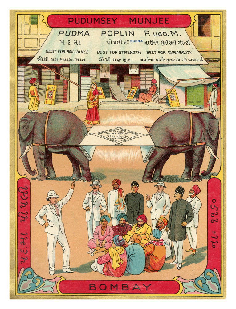
The ‘humble’ images in question are textile labels — lavishly illustrated postcard-sized paper labels that were pasted on yardages of mill-manufactured cloth. Around a central visual, the labels — which were both trademarks and advertisements — carried the names of British and Indian merchant agencies and mills, who traded and sold cotton goods and dyes in India.
The labels were not exclusive to the Indian market, they circulated in markets around the world that British and European machine-made goods travelled to. Each textile label (also known locally in some places on the Indian subcontinent as chaap or tikat (ticket) is a bearer of meaning and knowledge about larger processes and circumstances that are artfully captured on its surface, in eye-catching imagery and bursts of fantastic colour. They resound, as well, with a cacophony of the many languages of the region and the scripts in which these languages came to be written (English, of course, but also Bangla, Gujarati, Hindi, Marathi, Tamil, Telugu and Urdu, to name the most recurring scripts).
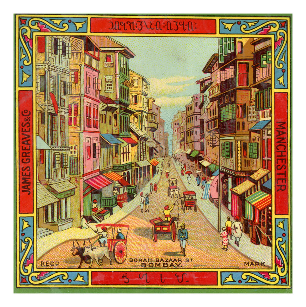
At the most basic level, such labels serve as advertisements for the products, which they seek to seduce the customer to purchase, repeatedly, and in vast quantities. At another level, they are the material embodiments of the commerce in cotton and cloth that connected diverse parts of the industrialising world, from the Americas to the farthest corners of Asia. Even as they reflect and illustrate the mobility of the materials that clothed, literally, such a connected world, they are mobile objects in and of themselves, frequently produced in England, especially Manchester, and travelling to distant markets on the face plates of cloth, or on bundles of bales.
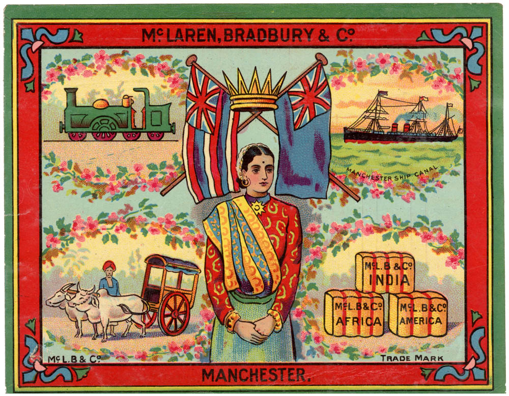
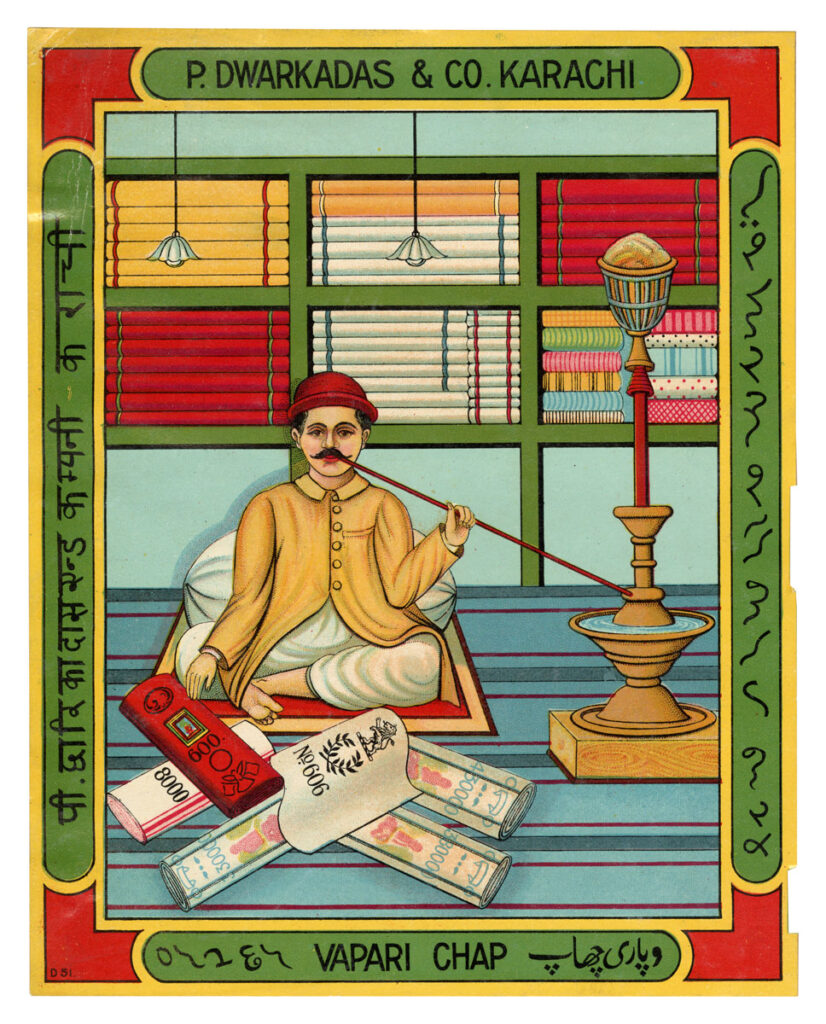
Because these images are so intimately connected with the subcontinental market, they centre India, exemplified by the map of the place (as imagined, mostly, under British colonial rule), by local beasts such as the lion or the exotic peacock, the bewitching bazaar, the alluring sari-clad woman, the bejewelled Maharaja, and of course, Mother India. Many images have didactic if not pedagogic intent, seeking to educate us about the nuts and bolts of the world of cloth, as we see in a label for P. Dwarkadas & Co., Karachi, in which a nattily-dressed vendor (vyapari) sits cross-legged on the floor of his shop stacked from floor to ceiling with neatly-folded colourful cloth, with several chaap, or trading stamps displayed in front of him (although, curiously and inexplicably, he is also shown smoking a hookah!), or in a label of McLaren, Bradbury and Co. of Manchester which shows the various modes of transport — ships, trains, even the bullock cart — that were summoned into action to sustain the world-wide commerce in cloth under the British flag.
Mass produced in the thousands, if not more, there is a repetitive quality to these images in their formal structure that might lead the less-engaged viewer to dismiss them for their lack of singularity, and to ignore the hard, creative labour that has gone into their production. In fact, it is important to ask why bother to illustrate at all, and with such imagination and vivacity?
A pat answer might well be that this is the easiest way to reach a largely (textually) illiterate consumer base, but this argument is undercut by the fact that almost always, these images (or more correctly “image-texts”) are replete with writing in various scripts which presumes the opposite, namely, the capacity of the consumer to be able to read. Instead, I prefer to see these dense visual objects as exemplary of the essential iconophilia of the Indic world, by which I mean not just the love of the image qua image, but also of the movement of the image and of its endless reworking to produce new ones.
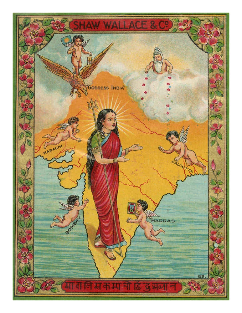
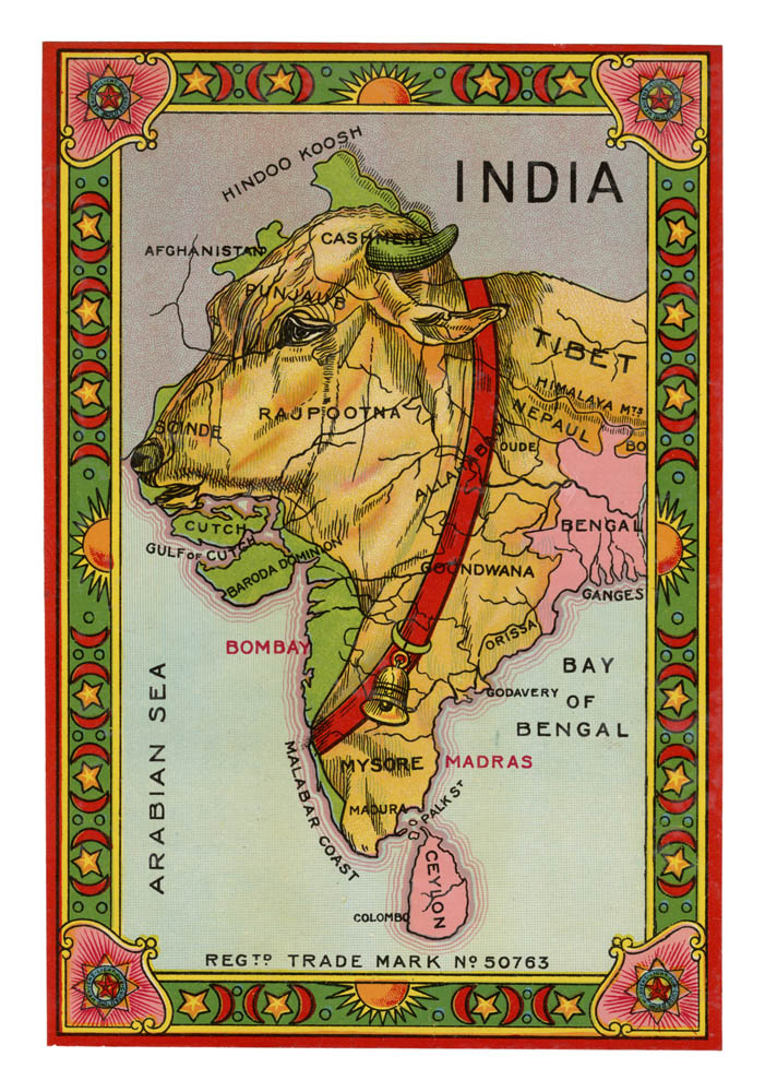
It is also productive to think of textile labels as mobile narrators of visual (hi)stories which compel us to look anew at, and to ask new questions of that past. Consider, for example, one such chaap, with the word “India,” inscribed in English. The label features the map of undivided India in three colours: pink is obviously used to capture parts of the subcontinent, including Ceylon (Sri Lanka), which were under formal colonial rule (with the cities of Bombay (Mumbai) and Madras (Chennai) also inscribed in pink), and yet, territories that were surely part of British India — such as Orissa (Odisha) or Punjab — are hued yellow. The colour green is used to distinguish princely or native states such as Baroda Dominion, some parts of Kashmir, and Afghanistan, and yet Bombay and Malabar, which were under British rule, are also coloured the same. A red sash with a bell stretched across the centre of the image makes us look again, only to see parts of the map morph into the head and torso of an ochre-coloured cow.
Is the image, then, urging us to consider the country not just as mapped territory, but instead, as a place where the cow as an animal is revered and held sacred? And yet, why would such a message matter to the makers and consumers of cloth? Is there a connection between cloth production and consumption, and the movement for “cow protection” that convulsed parts of India from the later 19th century? What does the image know that eludes us as contemporary viewers?
Even as we ask such questions, it is important to not forget that the textile label is also simultaneously a colonising object and a colonial object. Europeans first arrived in the land called India from the 16th century, in search of its famed cloth — silks, cottons, muslins — but did not remain content to stay as traders or consumers, becoming conquerors from the following century onwards. The intimate connection between the commerce in cloth and colonialism has been established by historical scholarship.
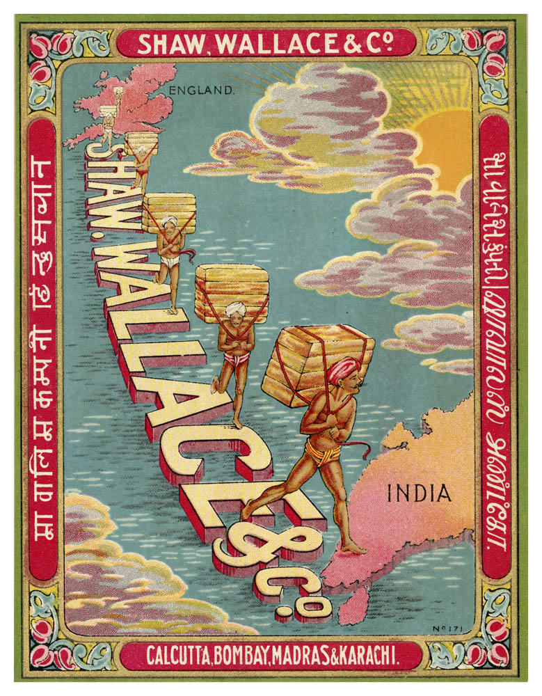
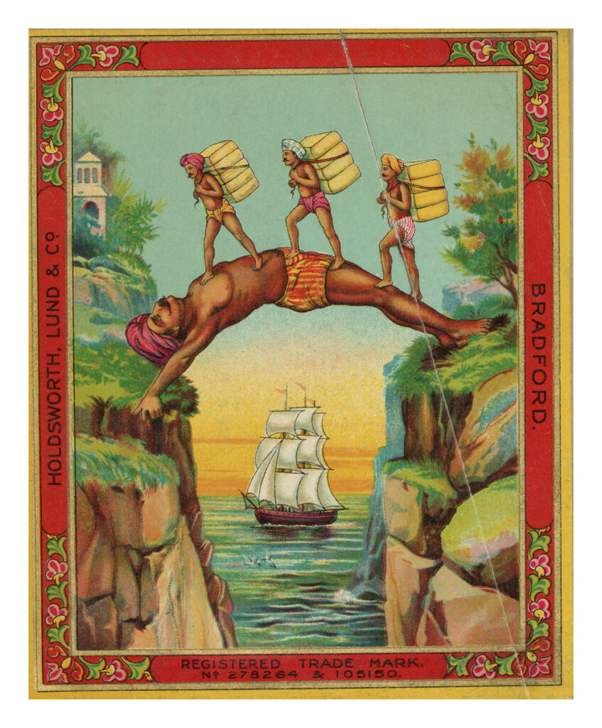
The humble and seemingly banal textile label is thus revealing of a vast political and economic process that fundamentally recast the world of modernity, creating structures that endure to this day. Thus, a textile label of the trading firm of Shaw, Wallace and Co. (which dealt in and with numerous subcontinent goods, including textiles) makes no attempt to conceal the hard reality of what was going on to sustain the connection between the commerce in cloth and the colonising of territories. The image shows “England” and “India” — both coloured pink, the hue of the British Empire in cartographic culture — separated by the blue ocean but bridged by the firm of Shaw, Wallace & Co. Surprisingly, the image also suggests that rather than the suited and booted (white) men who may well be sustaining the commerce that bound these places, it was the labouring, half-naked body of native men burdened with bales of textiles and yet firmly striding across the world, that did so. This is not the only such image in this collection that makes this subversive suggestion, as witnessed as well by a striking label for the Bradford-based Holdsworth, Lund & Co.
Labels such as these exemplify an argument I had made some years ago about the importance of “hating empire’s images, properly.” In making this argument, I was building on a suggestion by literary scholar Sunil Agnani, who suggested that we need to “hate empire properly,” by which he meant “entering into its terms and allowing the internal contradictions to be heightened rather than covered over by a political veil.” To paraphrase him, hating empire properly is a peculiar combination of an antagonistic relationship to empire, alongside an immersion in it. It is “a subtle form of inhabitation.” This form of “subtle inhabitation” of antagonism and immersion, of passionate hating and tragic loving at the same time is especially true, I believe, for our postcolonial encounter with empire’s images and artwork.
I am also inspired in this regard by anthropologist Liam Buckley who has written with great perceptiveness about the ethical dilemmas of working in the Gambian National Archives with colonial photographs in the postcolonial aftermath. “If projects of visual design were central to the regulation and presentation of the imperial world, then our encounter with that world was and remains via the medium of visual record. It was and remains love at first sight.” Paradoxically, while we may, as good postcolonial and decolonial scholars, hate empire, and with a passion, we are drawn to its images and its artwork, which we come to study with great care and intense thought, indeed, as Buckley insists, with love. These works undoubtedly “depict times that we no longer love,” but nevertheless “remain loved objects themselves.”
It is this condition of desiring-while-disavowing and disavowing-while-desiring that obliges us to hate empire’s art properly. The condition reminds us that many imperial art productions come down to us in the present as objects of great beauty and value, much sought after and collected, and much ruminated upon and discussed, long after formal systems of domination and oppression have drawn to a close. We need to arm ourselves with a particular ethic as we study and reflect upon these, an ethic that I name as hating empire’s images properly.
______
The exhibition Ticket Tika Chaap: The Art of the Trademark in Indo-British Textile Trade is on view at the Museum of Art & Photography (MAP), Bengaluru, until November 2025. The exhibition is a collaboration between MAP Academy and MAP.
Sumathi Ramaswamy is James B. Duke Distinguished Professor of History, Duke University, North Carolina, USA. She has published on language politics, gender studies, spatial studies and the history of cartography, visual studies and the modern history of art, and more recently, digital humanities and the history of philanthropy in modern India. She is a co-founder of Tasveerghar: A Digital Network of South Asian Popular Visual Culture.
